Recreating Fortnite's UI With Web Components

Nothing is more contentious than Web Components when it comes to the opinions of people who like the web and people who like React. Writing a frontend-framework-agnostic component and using it anywhere sounds pretty cool to me. I’ve read articles and hot takes about web components, but haven’t actually tried creating one. Let's see what all the fuss is about!
What’s a Web Component?
Web Components are reusable custom HTML elements that have all of their styling, HTML structure, and functionality neatly encapsulated. Although you don’t have to use all of them, most Web Components are made with three different technologies: custom elements, the shadow DOM, and HTML templates/slots.
What’s Fortnite?
Fortnite is a video game where you battle against 99 other people to be the last person standing. It’s so popular that tons of companies have united under the big banner of capitalism to license their characters out to the game for people to buy. There’s no other game where you can see Batman battling Obi-Wan Kenobi and Ariana Grande.
Dissecting the Design
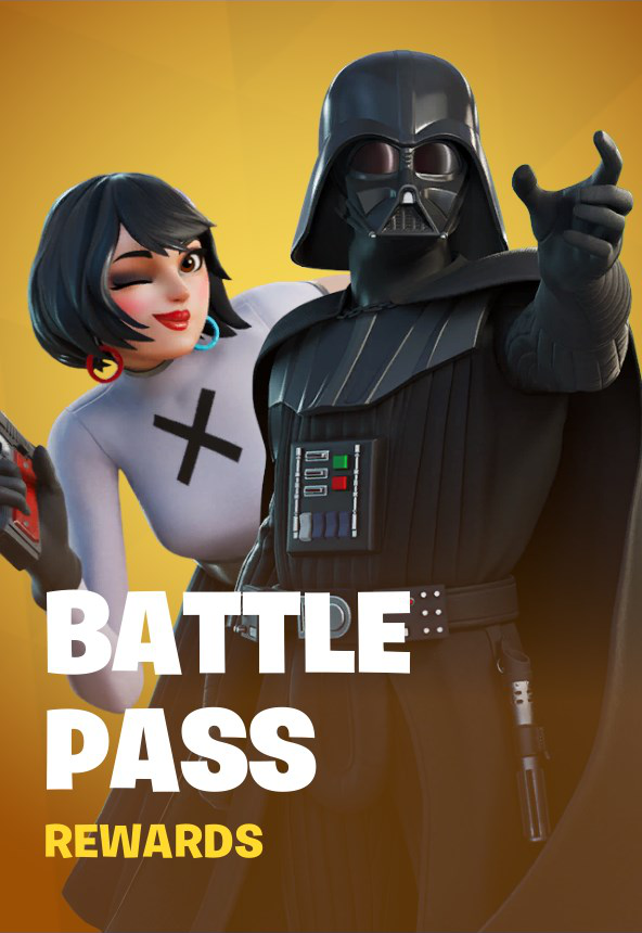
Fortnite’s UI has an aesthetic that’s much more interesting than anything I make in my day job, so I thought it would be fun to recreate something from that. We’re going to be recreating a button that’s used multiple times on the game’s “Battle Pass” screen. I don’t have access to any of the real files, so along with web components exploration we’re also going to be doing some design detective work.
Let’s take a look at what we’ll recreate!
There's two types of buttons on the page, a large orange "primary" button and a small blue "secondary" button. The behavior of these are both the same, so we can build one component with two different looks.
The button has a normal state and a hover state. Here's what those look like for the primary button:
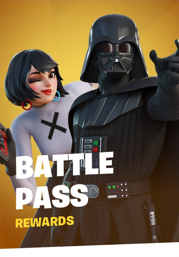

Normal State
Hover State
When hovered, the character images within the button are each scaled up (and translated slightly) to their final positions. The text is skewed along the Y-axis by 2 degrees, and a bottom bar (that's also skewed) translates up from the bottom of the screen. The foreground gradient covering the images along the bottom of the screen translates down slightly along the Y-axis. And the most noticeable thing is the boundaries of the button are scaled up.
In both states we can see there's a vignette effect along the corners and a very subtle triangle-patterned background that scrolls right-to-left at a 20 degree angle. Right behind the characters there's a radial gradient that starts the same color as the background and fades out to transparent. There's also a second gradient at the bottom of the screen that goes behind the characters and doesn't move. And, although it's impossible to tell from the screenshots, when a button is hovered the background flashes to a solid color briefly before fading out.
Normal State
Hover State
The secondary button has all the same traits, except all instances of the "orange" color have been changed to blue. The other difference is that the order of the white "primary" text and colored "secondary" text have been swapped when compared to the primary button.
So, let's see our final list of design elements we need to recreate:
Component Design Elements
- Animated Triangle Background
- Vignette
- Background Bottom Gradient
- Radial Gradient Background
- "Flash" Animation Background
- Character Images
- Foreground Bottom Gradient
- "Primary" text
- "Secondary" text
- Bottom bar
Background Break Down
Before we start coding, let's first get all of our assets ready. The one asset that's very hard to decipher is the animated background that's seemingly made up of different colored triangles.
Poking around the rest of the game we can actually run across this same background used elsewhere (albeit, scaled down a bit), and it's actually on a white background which makes it really easy to see what's going on.
Animated Background Example
Unfortunately for us it doesn't look like there's an actual repeating pattern here. All of the triangles have different shades, which points in the direction that they're dynamically generated with code using something called a shader.
There's two other hints that point us in that direction. The first is that when the button is hovered, the button expands and more of the background is revealed but the background doesn't move. For example, if the background's origin was the button's in the top left corner, when the button's boundaries are expanded the background's origin would shift with it and the whole background image would move.
Background Revealed on Hover
The other hint we get is that the background actually repeats across buttons. Which leads me to think it's a texture that's dynamically created (to get the random shades) and then aligned to the screen's coordinates. Instead of the background being attached to the button's top left corner, it's attached to the screen's top left corner. The backgrounds for the buttons then essentially act as a mask to reveal the patten that's going across the entire screen.
Take a look at this example mockup:


"Cool! How do we make it?" You might be asking. And uhhh, I don't know. This is getting into WebGL graphics programming territory and I don't know how to do any of that. So we'll instead just use a tileable background SVG and fake it as best we can.

Tileable Background SVG
Setting Up Our HTML
If you want to follow along, I created a zip file with the image assets and file structure you can download:
Let's get started on our component! Because web components are native to the web, we don't need any external libraries to start creating them. There are libraries such as Lit and Stencil that make writing web components a little less tedious, but we’ll be doing everything vanilla today.
The first thing we need to do is set up our HTML file. We'll do all the standard stuff here, and we'll add a CSS reset too. We're using Andy Bell's CSS Reset, but you can use whatever you want.
<!DOCTYPE html>
<html lang="en">
<head>
  <meta charset="utf-8">
  <title>Fortnite Button</title>
  <style>
    /* https://piccalil.li/blog/a-modern-css-reset/ */
    /* Box sizing rules */
    *,
    *::before,
    *::after {
      box-sizing: border-box;
    }

    /* Remove default margin */
    body,
    h1,
    h2,
    h3,
    h4,
    p,
    figure,
    blockquote,
    dl,
    dd {
      margin: 0;
    }

    /* Remove list styles on ul, ol elements with a list role, which suggests default styling will be removed */
    ul[role="list"],
    ol[role="list"] {
      list-style: none;
    }

    /* Set core root defaults */
    html:focus-within {
      scroll-behavior: smooth;
    }

    /* Set core body defaults */
    body {
      min-height: 100vh;
      text-rendering: optimizeSpeed;
      line-height: 1.5;
    }

    /* A elements that don't have a class get default styles */
    a:not([class]) {
      text-decoration-skip-ink: auto;
    }

    /* Make images easier to work with */
    img,
    picture {
      max-width: 100%;
      display: block;
    }

    /* Inherit fonts for inputs and buttons */
    input,
    button,
    textarea,
    select {
      font: inherit;
    }

    /* Remove all animations and transitions for people that prefer not to see them */
    @media (prefers-reduced-motion: reduce) {
      html:focus-within {
      scroll-behavior: auto;
      }
      *,
      *::before,
      *::after {
        animation-duration: 0.01ms !important;
        animation-iteration-count: 1 !important;
        transition-duration: 0.01ms !important;
        scroll-behavior: auto !important;
      }
    }
  </style>
</head>
<body>
</body>
</html>
I'm also going to go ahead and add the font face that Fortnite uses called "Burbank Big Regular" with a font weight of "Black". This font ain't free, so if you don't have a license then don't host it on your website unless you want to be sued into oblivion.
<!DOCTYPE html>
<html lang="en">
<head>
  <meta charset="utf-8">
  <title>Fortnite Button</title>
  <style>
    /* CSS Reset */
  </style>
+ <style>
+   @font-face {
+     font-family: "Burbank Big Regular Black";
+     src: url("assets/fonts/BurbankBigRegular-Black.woff2") format("woff2"),
+          url("assets/fonts/BurbankBigRegular-Black.woff") format("woff");
+   }
+ </style>
</head>
<body>
</body>
</html>
Let's work on our layout real quick. We'll start off with a main tag, and a CSS selector for it that centers its content vertically. We'll go ahead and add some padding to the top, so that when the buttons expand later, they don't get cut off. At the bottom we'll add a media query that horizontally centers the main's content after our screen gets wider than 866px. (We'll get to "Why 866px?" in a second.)
The div with the layout class sets up our grid with 3 columns and 2 rows that expand to the height and width of their content. There's also a 1rem gap in between the columns and rows, which works out to be 16px in this case.
<!DOCTYPE html>
<html lang="en">
  <head>
    <meta charset="utf-8" />
    <title>Fortnite Button</title>
    <style>
      /* CSS Reset */
    </style>
    <style>
      /* Font Import */
    </style>
+   <style>
+     main {
+       display: grid;
+       align-items: center;
+       width: 100%;
+       padding-top: 1rem;
+     }
+
+     .layout {
+       display: grid;
+       grid-gap: 1rem;
+       grid-template-columns: min-content min-content min-content;
+       grid-template-rows: min-content min-content;
+     }
+
+     @media (min-width: 866px) {
+       main {
+         justify-content: center;
+       }
+     }
+   </style>
  </head>
  <body>
+   <main>
+     <div class="layout">
+     </div>
+   </main>
  </body>
</html>
When thinking ahead about our web component, the plan is that it will expand to full width and height of its parent. That way if we ever want a different button size, we don't have to mess with our actual component's internals, we can just change the layout.
So we'll create two CSS classes, .primary-button and .secondary-button that have the dimensions we want the buttons to be in. In this case I'm hard-coding the height and width to very specific values to match the aspect ratio of the buttons seen in-game.
Anyway, the .primary-button class will span across two rows and one column and the .secondary-button class will span across one column and one row. We'll also change the background color to black for now so we can see them!
<!DOCTYPE html>
<html lang="en">
  <head>
    <meta charset="utf-8" />
    <title>Fortnite Button</title>
    <style>
      /* CSS Reset */
    </style>
    <style>
      /* Font Import */
    </style>
    <style>
      /* ... */

+     .primary-button {
+       grid-row: span 2 / span 2;
+       grid-column: span 1 / span 1;
+       height: 430px;
+       width: 296px;
+       background-color: black;
+     }
+
+     .secondary-button {
+       grid-row: span 1 / span 1;
+       grid-column: span 1 / span 1;
+       width: 269px;
+       height: 207px;
+       background-color: black;
+     }

      @media (min-width: 866px) {
        /* ... */
    </style>
  </head>
  <body>
    <main>
      <div class="layout">
+       <div class="primary-button"></div>
+       <div class="secondary-button"></div>
+       <div class="secondary-button"></div>
+       <div class="secondary-button"></div>
+       <div class="secondary-button"></div>
      </div>
    </main>
  </body>
</html>
And here's what we've got so far!
Coding the Web Component
Finally it's time to start working on our web component! I'm going to create a new file called script.js in the same directory as our HTML file. And we'll include it with a script tag right before our closing body tag:
<!DOCTYPE html>
<html lang="en">
  <head>
    <meta charset="utf-8" />
    <title>Fortnite Button</title>
    <style>
      /* ... */
    </style>
  </head>
  <body>
    <main>
      <!-- ... -->
    </main>
+   <script src="script.js"></script>
  </body>
</html>
To create our custom element in our script.js file, we'll first need to create a JavaScript class object that extends HTMLElement. Extending HTMLElement is a way to create an "autonomous custom element." We'll be able to use our custom element by writing <fortnite-button> in our HTML just like other tags.
Once we create our class, we write our constructor() method and inside of it call super(). Outside of our class, we need to register our custom element by writing customElements.define('fortnite-button', FortniteButton). Our custom element needs to be kebab-case, so they don't collide with built-in element names, so we'll call ours fortnite-button.
class FortniteButton extends HTMLElement {
  constructor() {
    super();
  }
}

customElements.define('fortnite-button', FortniteButton);
Next up we'll add our Shadow DOM to our component using attachShadow() with our mode set to open. Setting it to closed prevents us from accessing our shadow root from outside our component.
We'll also go ahead and start styling our comopnent. We create a new style tag, and then set its textContent with a template string. From there we just write some CSS as if we were writing it in its own file or style tag.
Since our styles will only affect elements in the Shadow DOM, we can drastically simplify our CSS. In fact, we can just select our button tag directly without having to add a class like .button. And since the DOM tree is so small, it'll be super performant to parse through.
Similarly to how we set the style tag's textContent, we can declaratively create our button element by setting our shadow root's innerHTML. Finally we'll be sure to prepend our style tag to the shadow root.
class FortniteButton extends HTMLElement {
  constructor() {
    super();
+
+   const shadow = this.attachShadow({ mode: 'open' });
+   const style = document.createElement('style');
+
+   style.textContent = `
+   button {
+     width: 100%;
+     height: 100%;
+     border: none;
+     outline: none;
+   }
+   `;
+
+   shadow.innerHTML = `
+   <button>
+     Fortnite Button
+   </button>
+   `;
+
+   shadow.prepend(style);
  }
}

customElements.define('fortnite-button', FortniteButton);
Now that we've got a style button inside our custom element, we can finally add our custom element to our HTML and see what it looks like. We can just replace all of our div tags with our fortnite-button custom element.
<!DOCTYPE html>
<html lang="en">
  <head>
    <!-- ... -->
  </head>
  <body>
    <main>
      <div class="layout">
+       <fortnite-button class="primary-button">
+       </fortnite-button>
+       <fortnite-button class="secondary-button">
+       </fortnite-button>
+       <fortnite-button class="secondary-button">
+       </fortnite-button>
+       <fortnite-button class="secondary-button">
+       </fortnite-button>
+       <fortnite-button class="secondary-button">
+       </fortnite-button>
      </div>
    </main>
    <script src="script.js"></script>
  </body>
</html>
Faking the Shader
We've got a super basic version of our custom component working! Let's figure out how we can mimic the behavior of the custom shader that's used for the background.
Our goal is to have a scrolling, tiling background that we can uncover more of when we hover over component. Let's add some code.
class FortniteButton extends HTMLElement {
  constructor() {
    /* ... */

    style.textContent = `
    button {
+    position: relative;
      width: 100%;
      height: 100%;
      border: none;
      outline: none;
    }
+
+   .wrapper {
+     position: absolute;
+     top: 0;
+     left: 0;
+     width: 100%;
+     height: 100%;
+     transform: scale(1.04);
+     background: linear-gradient(0deg, rgba(0,84,255,1) 0%,
+                 rgba(255,255,255,1) 2%,  rgba(255,255,255,1) 98%,
+                 rgba(248,14,117,1) 100%);
+     opacity: 0.5;
+   }
    `;

    shadow.innerHTML = `
    <button>
-     Fortnite Button
+     <div class="wrapper">
+     </div>
    </button>
    `;

    shadow.prepend(style);
  }
}

customElements.define('fortnite-button', FortniteButton);
The first thing we'll do is add a relative position to our main button.
Skipping down to the HTML for a second, we'll replace our "Fortnite Button" text with a div that has a wrapper class. In our CSS, we'll create a wrapper class selector that's absolutely positioned to the top left and has the same width and height as its parent.
The key here is the transform: scale(1.04) which will increase the size of our wrapper by 4% in all directions. We'll also go ahead and add a gradient background with a pink line at the top and blue line at the bottom so you can tell where our wrapper is. For demonstration purposes, we'll make the opacity 50% so that you can see how our wrapper
is 4% bigger than our button.
class FortniteButton extends HTMLElement {
  constructor() {
    /* ... */

    style.textContent = `
    button {
      position: relative;
      width: 100%;
      height: 100%;
      border: none;
      outline: none;
+    clip-path: inset(0);
+    transition: clip-path 150ms linear;
    }
+
+   button:hover, button:focus {
+     clip-path: inset(-4% -4% -4% -4%);
+   }

    .wrapper {
      position: absolute;
      top: 0;
      left: 0;
      width: 100%;
      height: 100%;
      transform: scale(1.04);
      background: linear-gradient(0deg, rgba(0,84,255,1) 0%,
                  rgba(255,255,255,1) 2%,  rgba(255,255,255,1) 98%,
                  rgba(248,14,117,1) 100%);
-     opacity: 0.5;
    }
    `;

     /* ... */
  }
}

customElements.define('fortnite-button', FortniteButton);
So now our goal is to hide the wrapper by default, and then reveal it when hovering over out button. To do that we add clip-path: inset(0) to our button. This will create a clipping region that's exactly the same as our current boundaries.
We add CSS selectors for our button's :hover and :focus states. When we hover or focus on the button, our clip-path is going to get bigger than our button by 4% in all directions, which is the same amount as our wrapper is scaled. This will reveal
our wrapper that's positioned outside the button's bounding box. If you hover or focus on a button, you should be able to see our gradient with a pink line at the top and a blue line at the bottom. Those are always there, they're just hidden by the clip-path until we hover.
To make the animation between the two states smooth, we'll add a clip-path transition to our button as well.
Time to add our SVG triangle image that we created before to our background!
class FortniteButton extends HTMLElement {
  constructor() {
    /* ... */

    style.textContent = `
    /* ... */

    .wrapper {
      position: absolute;
      top: 0;
      left: 0;
      width: 100%;
      height: 100%;
      transform: scale(1.04);
+     overflow: hidden;
+     background-color: white;
-     background: linear-gradient(0deg, rgba(0,84,255,1) 0%,
-                 rgba(255,255,255,1) 2%,  rgba(255,255,255,1) 98%,
-                 rgba(248,14,117,1) 100%);
    }
+
+   .scrolling-bg {
+     position: absolute;
+     top: -100%;
+     left: -100%;
+     width: 400%;
+     height: 400%;
+     background: url('assets/images/background.svg');
+     background-size: 100px;
+     animation: 50s infinite infinite-scroll;
+     animation-timing-function: linear;
+   }
+
+   @keyframes infinite-scroll {
+     from {
+       transform: rotate(15deg) translateX(0px);
+     }
+
+     to {
+       transform: rotate(15deg) translateX(-100px);
+       // translateX's value is the background-size of .scrolling-bg
+     }
+   }
    `;

    shadow.innerHTML = `
    <button>
      <div class="wrapper">
+       <div class="scrolling-bg"></div>
      </div>
    </button>
    `;

    /* ... */
  }
}

customElements.define('fortnite-button', FortniteButton);
We're using a classic technique here to make a background appear to be scrolling infinitely. Let's say we're trying to make something infinitely scroll on the X-axis. The basic idea is to double the width of the background, and then translate the image along the X-axis by the width of your original image. Once it translates the width of your original image, it matches the starting position perfectly, so you just reset the animation.
In our case, we're translating our background along the X-axis, but we're also rotating it by 15deg. So to make sure we don't have gaps that our background doesn't cover, we start it -100% to the left and top, and increase the height and width by 400%.
The animation in-game is very slow, so ours lasts 50 seconds to complete a full loop.
It's not perfect! The backgrounds don't align across buttons like they do in-game, but it'll be less noticable once we add more stuff over top!
Adding Some Color
In order to differentiate between the "primary" and "secondary" buttons, we're going to have to pass some information to our components. We'll do this through a type attribute, which for now will control how text should be displayed, and a color attribute that controls what color scheme the button should use.
Let's start by adding a color attribute in our HTML and setting the values to yellow and blue.
<!DOCTYPE html>
<html lang="en">
  <head>
    <!-- ... -->
  </head>
  <body>
    <main>
      <div class="layout">
+       <fortnite-button class="primary-button" color="yellow">
        </fortnite-button>
+       <fortnite-button class="secondary-button" color="blue">
        </fortnite-button>
+       <fortnite-button class="secondary-button" color="blue">
        </fortnite-button>
+       <fortnite-button class="secondary-button" color="blue">
        </fortnite-button>
+       <fortnite-button class="secondary-button" color="blue">
        </fortnite-button>
      </div>
    </main>
    <script src="script.js"></script>
  </body>
</html>
We'll first set up a color constants object called COLOR, and add our "yellow" and "blue" values to that, just so we're not passing strings around. Then we'll access the color attribute we just added to our HTML in our component code using getAttribute, and set the default color to COLOR.YELLOW if a user doesn't pass in a color attribute.
class FortniteButton extends HTMLElement {
  constructor() {
    super();

+  const COLOR = {
+    YELLOW: "yellow",
+    BLUE: "blue",
+  };

+  this.color = this.getAttribute('color') || COLOR.YELLOW;

    const shadow = this.attachShadow({ mode: 'open' });
    /* ... */
We can then use our color variable as a CSS class, and add it to our button in the Shadow DOM.
class FortniteButton extends HTMLElement {
  constructor() {
    /* ... */

    shadow.innerHTML = `
+   <button class="${this.color}">
      <div class="wrapper">
        <div class="scrolling-bg"></div>
      </div>
    </button>
    `;

    shadow.prepend(style);
  }
}
When we did our design dissection there were a lot of the same colors used throughout multiple parts of the design. For instance, there's a vignette effect around the whole button, and it uses the same color as the gradient that comes up from the bottom of the button. This would be a perfect use case for color variables that we can use in multiple places.
A few years ago we may have had to use a CSS preprocessor like Sass to create variables, but now we can use CSS Custom Properties that are built right into the browser to achieve the same thing. Let's create some for each color we'll be needing.
class FortniteButton extends HTMLElement {
  constructor() {
    /* ... */

    style.textContent = `
+   :host {
+     --color-dark: 173,104,18;
+     --color-medium: 244,203,76;
+     --color-light: 252,214,82;
+     --color-subtext: 255,209,49;
+   }

    button {
      position: relative;
      width: 100%;
      height: 100%;
      border: none;
      outline: none;
      clip-path: inset(0);
      transition: clip-path 150ms linear;
    }

    button:hover, button:focus {
      clip-path: inset(-4% -4% -4% -4%);
    }

+   button.${COLOR.BLUE} {
+     --color-dark: 34,51,216;
+     --color-medium: 0,166,255;
+     --color-light: 0,166,255;
+     --color-subtext: 41,219,255;
+   }

    /* ... */
With the :host psuedo-class selector we can set up our CSS Custom Properties in our shadow root host. Our variables will be --color-dark, --color-medium, --color-light which refer to the three shadows of our color. And then we also have --color-subtext which will be the color of our "sub title" text later on.
When you normally think of creating a color variable, you expect the value to be a hex code (#ad6812) or even an rgb color function (rgb(173, 104, 18)). But, custom properties can be any valid CSS value and in our case, our values are comma-separated red, green, and blue values such as 173,104,18. Having our variables set up like this, we can use them within rgba color functions like this: rgba(var(--color-medium), 0.5) which allows us to set the alpha value to whatever we need.
Our initial values for our custom properties in our :host selector are going to be for our "yellow" color, since that's the default value we've set up for our color variable in our constructor. Since we add a .blue class to our button when the user passes "blue" as a color attribute value on our component, we can target the .blue class with the CSS selector button.${COLOR.BLUE} and override our initial yellow rgb custom property values to use blue rgb values.
Now let's use our variables we've set up by creating a vignette background that will be below our scrolling background. First we'll add a new div to our component's HTML with a class of vignette-bg.
class FortniteButton extends HTMLElement {
  constructor() {
    /* ... */

    shadow.innerHTML = `
    <button class="${this.color}">
      <div class="wrapper">
+       <div class="vignette-bg"></div>
        <div class="scrolling-bg"></div>
      </div>
    </button>
    `;

    shadow.prepend(style);
  }
}
In our component's CSS we'll add a selector for our class. We absolutely position the element with it stretched out across our whole button, and then we use our CSS Custom Properties in a radial-gradient function call for the background. Our gradient starts with our --color-medium and then changes to --color-dark on the edges, giving a vignette effect.
You can see we access our CSS Custom Properties using a var function call with our custom property name passed in as the first argument, like so:var(--color-medium).
class FortniteButton extends HTMLElement {
  constructor() {
    /* ... */

    style.textContent = `
    /* ... */

+   .vignette-bg {
+     position: absolute;
+     top: 0;
+     left: 0;
+     width: 100%;
+     height: 100%;
+     background: radial-gradient(rgb(var(--color-medium)),
+                 rgb(var(--color-dark)));
+   }

    .scrolling-bg {
      /* ... */
Radial Gradient
One of the things that's hard to decipher in-game is how the background gets lighter in the middle of the button. My initial thought was that there was a specular highlight built in to the shader, which could be true. The other thing that could be happening is it's simply a radial gradient with a lighter color overlaid on top of the background.
The latter is easiest for us to implement, so we'll choose that. Let's create a new div in our component's HTML with a class of radial-gradient after our scrolling-bg div so the gradient will be displayed on top of the background.
class FortniteButton extends HTMLElement {
  constructor() {
    /* ... */

    shadow.innerHTML = `
    <button class="${this.color}">
      <div class="wrapper">
        <div class="vignette-bg"></div>
        <div class="scrolling-bg"></div>
+       <div class="radial-gradient"></div>
      </div>
    </button>
    `;

    shadow.prepend(style);
  }
}
And then we'll add some CSS that's similar to our vignette, but it will fade out to be transparent on the edges. It looks kind of intense right now, but we'll cover it up with our images later.
class FortniteButton extends HTMLElement {
  constructor() {
    /* ... */

    style.textContent = `
    /* ... */

+   .radial-gradient {
+     position: absolute;
+     top: 0;
+     left: 0;
+     width: 100%;
+     height: 100%;
+     background: radial-gradient(
+                 rgba(var(--color-medium),1) 45%,
+                 rgba(var(--color-medium), 0.5) 75%,
+                 rgba(var(--color-dark),0) 100%);
+   }

    @keyframes infinite-scroll {
      /* ... */
"Flash" Animation
Next up we need to add our little "flash" animation that happens when we hover over the button. Whenever the user mouses over the button, an (almost) full color background quickly appears on the screen and then fades out. It's pretty subtle, but it adds a lot of impact.
So, first thing's first, let's add a div with the class flash to our component's HTML that we can animate.
class FortniteButton extends HTMLElement {
  constructor() {
    /* ... */

    shadow.innerHTML = `
    <button class="${this.color}">
        <div class="wrapper">
          <div class="vignette-bg"></div>
          <div class="scrolling-bg"></div>
          <div class="radial-gradient"></div>
+         <div class="flash"></div>
        </div>
      </button>
    `;

    shadow.prepend(style);
  }
}
We'll also go and add our CSS for our new class.
class FortniteButton extends HTMLElement {
  constructor() {
    /* ... */

    style.textContent = `
    /* ... */

+   .flash {
+     position: absolute;
+     top: 0;
+     left: 0;
+     width: 100%;
+     height: 100%;
+     background: radial-gradient(rgb(var(--color-light)),
+                 rgb(var(--color-medium)));
+     opacity: 0;
+   }

    @keyframes infinite-scroll {
      /* ... */
Surprise, another radial gradient that covers the whole screen! The one difference here is that we'll set the initial opacity to 0 so that the user won't see it until we hover.
So how should we handle the animation? We could create a CSS animation and trigger it with :hover and :focus pseudo-classes, but the one thing I don't like about those is that our animation will stop playing after we stop hovering or focusing.
There's two ways we can keep the animation going after the user moves away. One is to use CSS transitions, but if we implement this, the full animation won't actually play. Assuming the animation goes from 0 opacity to 100, if the user takes their mouse away at 50 opacity, then it'll just go back down to zero instead of continuing to 100 and then back to zero. Not what we want.
The other way we can get our animation to continue even after we move away is with JavaScript and the Web Animations API. You may have heard in the past that animation with JavaScript is bad, and it is depending on how you do it! If you're writing JavaScript animations that rely on the main thread, such as creating a for-loop and editing styles per loop, you're going to get some terribly janky results. The Web Animations API, on the other hand, runs animations on the compositor thread like CSS Animations, outside of the main thread. This allows us to create animations with JavaScript while keeping silky smooth framerates.
First, let's set up some listeners for mouseover and focus. We'll do this in our lifecycle callback, connectedCallback. And in disconnectedCallback we'll remove our listeners so we don't get a memory leak.
class FortniteButton extends HTMLElement {
  constructor() {
    /* ... */
  }

+ connectedCallback() {
+   this.addEventListener("mouseover", this.mouseOverListener);
+   this.addEventListener("focus", this.focusListener);
+ }
+
+ disconnectedCallback() {
+   this.removeEventListener("mouseover", this.mouseOverListener);
+   this.removeEventListener("focus", this.focusListener);
+ }
}
When we mouse over our web component we call a method mouseOverListener, and when we focus on it we'll call a method focusListener.
class FortniteButton extends HTMLElement {
  constructor() {
    /* ... */
  }

  connectedCallback() {
    this.addEventListener("mouseover", this.mouseOverListener);
    this.addEventListener("focus", this.focusListener);
  }

  disconnectedCallback() {
    this.removeEventListener("mouseover", this.mouseOverListener);
    this.removeEventListener("focus", this.focusListener);
  }

+ mouseOverListener() {
+   this.playFlashAnimation();
+ }
+
+ focusListener() {
+    this.playFlashAnimation();
+ }
}
Both of these will do the same thing: call a method called playFlashAnimation. Let's go ahead and add that method!
class FortniteButton extends HTMLElement {
  constructor() {
    /* ... */
  }

  connectedCallback() {
    this.addEventListener("mouseover", this.mouseOverListener);
    this.addEventListener("focus", this.focusListener);
  }

  disconnectedCallback() {
    this.removeEventListener("mouseover", this.mouseOverListener);
    this.removeEventListener("focus", this.focusListener);
  }

  mouseOverListener() {
    this.playFlashAnimation();
  }

  focusListener() {
     this.playFlashAnimation();
  }

+ playFlashAnimation() {
+   this.shadowRoot
+     .querySelector(".flash")
+     .animate(
+       [
+         { opacity: "0" },
+         { opacity: "0.5", offset: 0.15 },
+         { opacity: "0" }
+       ],
+       {
+         fill: "forwards",
+         duration: 500,
+       }
+     );
+ }
}
For this animation, we look for our first (and in this case, only) element with a class of flash in our component. We then create an array of keyframes we want to happen in our animation. Our first keyframe has the element's opacity starting at 0, and then 15% of the way through the animation we want it to reach 0.5 opacity, and finally go back down to 0.
The options object has the properties fill: "forwards" which will persist the styling that our animation stops at instead of resetting to what's in the stylesheet. The duration property simply has a value in milliseconds for how long the animation should last.
Bottom Gradient(s)
One of the next things we'll add is our bottom gradient. Now, just looking at things at face-value, it looks like there's only one gradient coming up from the bottom of the component. But we can see that there's a gradient that's overtop of the character images that's nowhere near as dark as gradient behind them. So we've actually got two gradients on top of one another, with the character images sandwiched between them.
Let's add a couple divs with the class of bottom-gradient to our HTML.
class FortniteButton extends HTMLElement {
  constructor() {
    /* ... */

    shadow.innerHTML = `
    <button class="${this.color}">
        <div class="wrapper">
          <div class="vignette-bg"></div>
          <div class="scrolling-bg"></div>
          <div class="radial-gradient"></div>
          <div class="flash"></div>
+         <div class="bottom-gradient"></div>
+         <div class="bottom-gradient"></div>
        </div>
      </button>
    `;

    shadow.prepend(style);
  }
}
And then we'll add our CSS.
class FortniteButton extends HTMLElement {
  constructor() {
    /* ... */

    style.textContent = `
    /* ... */

+   .bottom-gradient {
+     position: absolute;
+     top: 0;
+     left: 0;
+     width: 100%;
+     height: 100%;
+     background: linear-gradient(
+       to top,
+       rgba(var(--color-dark),1) 0%,
+       rgba(var(--color-dark), 0.738) 19%,
+       rgba(var(--color-dark), 0.541) 34%,
+       rgba(var(--color-dark), 0.382) 47%,
+       rgba(var(--color-dark), 0.278) 56.5%,
+       rgba(var(--color-dark), 0.194) 65%,
+       rgba(var(--color-dark), 0.126) 73%,
+       rgba(var(--color-dark), 0.075) 80.2%,
+       rgba(var(--color-dark), 0.042) 86.1%,
+       rgba(var(--color-dark), 0.021) 91%,
+       rgba(var(--color-dark), 0.008) 95.2%,
+       rgba(var(--color-dark), 0.002) 98.2%,
+       rgba(var(--color-dark), 0) 100%
+     );
+     transform: translateY(25%);
+     transition: transform 150ms ease-out;
+   }

    @keyframes infinite-scroll {
      /* ... */
Standard stuff we've seen before, we're translating the gradient 25% down and setting up a transition to animate the transform. The line-gradient may seem very verbose, but this sort of easing gets us a really soft falloff. Check out this CSS Tricks article for more.
In-game the gradient actually moves down when the user hovers over the button, so we'll go ahead and add a CSS transition for that.
class FortniteButton extends HTMLElement {
  constructor() {
    /* ... */

    style.textContent = `
    /* ... */

    .bottom-gradient {
      /* ... */
    }
+
+   button:hover > * > .bottom-gradient,
+   button:focus > * > .bottom-gradient {
+     transform: translateY(35%);
+   }

    @keyframes infinite-scroll {
      /* ... */
So now when we hover or focus on our button, we'll move our divs with the bottom-gradient class down 10%.
Placeholder Images
In the last section I mentioned how we'd have our character images tucked in between our two gradients. Spoiler alert for later in the article: we're going to add a whole other component for these images. For now though, we'll add some placeholders just to have something close to the final product while we're working.
The first thing we'll do is use a slot element in our component's HTML. A slot allows us to pass markup from our web page into our component. Since this slot doesn't have a name attribute, it will be our default slot and any markup between our custom element's opening and closing tags in the Light DOM will be put in our slot in our Shadow DOM.
Let's add our slot to our web component's HTML.
class FortniteButton extends HTMLElement {
  constructor() {
    /* ... */

    shadow.innerHTML = `
    <button class="${this.color}">
        <div class="wrapper">
          <div class="vignette-bg"></div>
          <div class="scrolling-bg"></div>
          <div class="radial-gradient"></div>
          <div class="flash"></div>
          <div class="bottom-gradient"></div>
+         <slot></slot>
          <div class="bottom-gradient"></div>
        </div>
      </button>
    `;

    shadow.prepend(style);
  }
}
And now to get an image into our component we'll use a regular ol' img tag. Because our .wrapper class has absolute positioning, we can add absolute positioning to our image to get it where we want. For now we'll just add inline styles to each image.
<!DOCTYPE html>
<html lang="en">
  <head>
    <!-- ... -->
  </head>
  <body>
    <main>
      <div class="layout">
        <fortnite-button class="primary-button" color="yellow">
+         <img src="assets/images/darth_vader.webp"
+              style="position: absolute;
+                     bottom: -11%;
+                     left: -30%;
+                     width: 154%;
+                     max-width: max-content;" />
        </fortnite-button>
        <fortnite-button class="secondary-button" color="blue">
+         <img src="assets/images/darth_vader.webp"
+              style="position: absolute;
+                     top: 9%;
+                     left: -30%;
+                     width: 154%;
+                     max-width: max-content;" />
        </fortnite-button>
      </div>
    </main>
    <script src="script.js"></script>
  </body>
</html>
Adding Some Text
The next thing we need to do is add our text to let users know where they're going when they click on the button.
In-game there's two different layouts for the text, one where there's white "text" on top and colored "sub-text" on bottom, and another layout where the white "text" is on bottom and colored "sub-text" on top.
These text layouts correspond directly with the "type" of button. When we were breaking down the design I called the orange button our "primary" button and the blue our "secondary" button, so let's go with those for our types.
Similar to COLOR, let's create a constant called TYPE that has PRIMARY and SECONDARY values.
We'll also pass in a custom type attribute in our HTML and parse it like we do our color attribute.
class FortniteButton extends HTMLElement {
  constructor() {
    super();
+  const TYPE = {
+    PRIMARY: "primary",
+    SECONDARY: "secondary",
+  };

    const COLOR = {
      YELLOW: "yellow",
      BLUE: "blue",
    };

+  this.type = this.getAttribute("type") || TYPE.PRIMARY;
    this.color = this.getAttribute('color') || COLOR.YELLOW;

    /* ... */
  }
}
And we'll add our attributes in our HTML.
<!DOCTYPE html>
<html lang="en">
  <head>
    <!-- ... -->
  </head>
  <body>
    <main>
      <div class="layout">
         <fortnite-button class="primary-button"
+                         type="primary"
                          color="yellow">
          <img src="assets/images/darth_vader.webp"
               style="position: absolute;
                      bottom: -11%;
                      left: -30%;
                      width: 154%;
                      max-width: max-content;" />
        </fortnite-button>
        <fortnite-button class="secondary-button"
+                        type="secondary"
                         color="blue">
          <img src="assets/images/darth_vader.webp"
               style="position: absolute;
                      top: 9%;
                      left: -30%;
                      width: 154%;
                      max-width: max-content;" />
        </fortnite-button>
      </div>
    </main>
    <script src="script.js"></script>
  </body>
</html>
Let's do the same thing we did with the type attribute, and get two more attributes: text and subtext.
class FortniteButton extends HTMLElement {
  constructor() {
    /* ... */

    this.type = this.getAttribute("type") || TYPE.PRIMARY;
    this.color = this.getAttribute('color') || COLOR.YELLOW;
+   this.text = this.getAttribute("text") || "";
+   this.subtext = this.getAttribute("subtext") || "";

    /* ... */
  }
}
And we'll go ahead and populate our new attributes in our custom elements with that same text from the game.
text will be our white text, and subtext will be our colored text.
<!DOCTYPE html>
<html lang="en">
<head>
<!-- ... -->
</head>
<body>
<main>
<div class="layout">
<fortnite-button class="primary-button"
type="primary"
color="yellow"
+ text="Battle<br>Pass"
+ subtext="Rewards">
<img src="assets/images/darth_vader.webp"
style="position: absolute;
bottom: -11%;
left: -30%;
width: 154%;
max-width: max-content;" />
</fortnite-button>
<fortnite-button class="secondary-button"
type="secondary"
color="blue"
+ text="Snap"
+ subtext="Assemble">
<img src="assets/images/darth_vader.webp"
style="position: absolute;
top: 9%;
left: -30%;
width: 154%;
max-width: max-content;" />
</fortnite-button>
<fortnite-button class="secondary-button"
type="secondary"
color="blue"
+ text="Indiana Jones"
+ subtext="Coming Soon">
<img src="assets/images/darth_vader.webp"
style="position: absolute;
top: 9%;
left: -30%;
width: 154%;
max-width: max-content;" />
</fortnite-button>
<fortnite-button class="secondary-button"
type="secondary"
color="blue"
+ text="Rewards"
+ subtext="Bonus">
<img src="assets/images/darth_vader.webp"
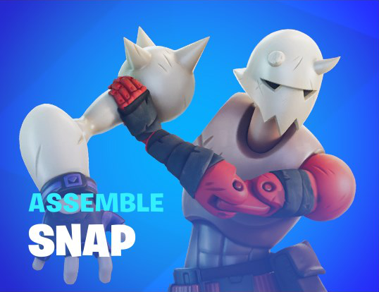
style="position: absolute;
top: 9%;
left: -30%;
width: 154%;
max-width: max-content;" />
</fortnite-button>
<fortnite-button class="secondary-button"
type="secondary"
color="blue"
+ text="Fortnite Crew"
+ subtext="Join The">
<img src="assets/images/darth_vader.webp"
style="position: absolute;
top: 9%;
left: -30%;
width: 154%;
max-width: max-content;" />
</fortnite-button>
</div>
</main>
<script src="script.js"></script>
</body>
</html>Now that we've got all of our data, let's use it!
class FortniteButton extends HTMLElement {
  constructor() {
    /* ... */

    shadow.innerHTML = `
    <button class="${this.color}">
        <div class="wrapper">
          <div class="vignette-bg"></div>
          <div class="scrolling-bg"></div>
          <div class="radial-gradient"></div>
          <div class="flash"></div>
          <div class="bottom-gradient"></div>
          <slot></slot>
          <div class="bottom-gradient"></div>
+         <div class="text-wrapper text-wrapper--${this.type}">
+           <h2 class="text text--${this.type}">${this.text}</h2>
+           <p class="subtext subtext--${this.type}">${this.subtext}</p>
+         </div>
        </div>
      </button>
    `;

    shadow.prepend(style);
  }
}
We'll create a div with a text-wrapper class and use our type variable to create a modifier class text-wrapper--${this.type} which will change the order of our text for "secondary" type buttons.
Inside of our wrapper div, we'll create an h2 tag with text and text--${this.type} classes. Our text content for our h2 will come from our text variable.
Subtext will work the same way, except we'll use a p tag instead of an h2.
Let's start adding our CSS and making everything look nice!
class FortniteButton extends HTMLElement {
  constructor() {
    /* ... */

    style.textContent = `
    /* ... */

+   .text-wrapper {
+     position: absolute;
+     bottom: 9%;
+     left: 8.25%;
+     width: 100%;
+     display: flex;
+     flex-direction: column;
+     text-align: left;
+     font-family: "Burbank Big Regular Black", Arial;
+     text-transform: uppercase;
+     transition: transform 150ms ease-out;
+   }
+
+   .text-wrapper--${TYPE.SECONDARY} {
+     flex-direction: column-reverse;
+     left: 9%;
+     bottom: 11%;
+   }

    button:hover > * > .bottom-gradient,
    button:focus > * > .bottom-gradient {
      /* ... */
Fairly standard stuff regarding positioning that we've encountered already. We're adding display: flex and changing the flex direction to column, so that our text is stacked vertically.
We align our text left, and make it use our custom font, Burbank Big Regular Black. To separate the data from the presentation, we use text-transform: uppercase; so the user doesn't have to worry about the text being capitalized in the HTML.
In our "modifier" class, .text-wrapper--${TYPE.SECONDARY} we use our constants we set up at the top of our constructor. So in this case, for fortnite-buttons with type="secondary" we'll change the direction of our flex so that the "subtext" is on top and the "text" is on the bottom.
We also have to make some small adjustments to the left and bottom positioning to better match what's in-game.
class FortniteButton extends HTMLElement {
  constructor() {
    /* ... */

    style.textContent = `
    /* ... */

    .text-wrapper--${TYPE.SECONDARY} {
      /* ... */
    }

+   .text {
+     color: white;
+     font-size: 3rem;
+     line-height: 3.25rem;
+     letter-spacing: 0.1rem;
+     margin: 0.25rem 0 0 0;
+   }
+
+   .text--${TYPE.SECONDARY} {
+     font-size: 1.7rem;
+     line-height: 1.7rem;
+     margin: 0.25rem 0 0 0;
+     letter-spacing: 0.1rem;
+   }

    button:hover > * > .bottom-gradient,
    button:focus > * > .bottom-gradient {
      /* ... */
Here we're just doing a similar thing like we did with .text-wrapper and its modifier class. These values are just what I eventually landed on when comparing to what's found in-game.
class FortniteButton extends HTMLElement {
  constructor() {
    /* ... */

    style.textContent = `
    /* ... */

    .text--${TYPE.SECONDARY} {
      /* ... */
    }

+   .subtext {
+     color: rgb(var(--color-subtext));
+     font-size: 1.25rem;
+     line-height: 1rem;
+     letter-spacing: 0.1rem;
+     margin: 0.25rem 0 0 0;
+   }
+
+   .subtext--${TYPE.SECONDARY} {
+     font-size: 1.1rem;
+     line-height: 1.1rem;
+   }

    button:hover > * > .bottom-gradient,
    button:focus > * > .bottom-gradient {
      /* ... */
We're doing almost the same exact thing with these subtext classes as our text classes.
class FortniteButton extends HTMLElement {
  constructor() {
    /* ... */

    style.textContent = `
    /* ... */

    button:hover > * > .bottom-gradient,
    button:focus > * > .bottom-gradient {
      /* ... */
    }

+   button:hover > * > .text-wrapper,
+   button:focus > * > .text-wrapper {
+     transform: skew(0deg, -2deg) translateY(-1rem);
+   }

    @keyframes infinite-scroll {
      /* ... */
Our final bit of CSS will skew our text -2 degrees and translate it upwards vertically when our button is hovered or focused.
The Bottom Bar
The final piece we need for our fortnite-button component is what we'll call the "bottom bar", that pops up when you hover or focus on the button.
We'll add a div with a class of bar and a modified class of bar--${this.type}, because the bar that shows up for "secondary" buttons is a slightly different size than "primary" buttons' bars.
class FortniteButton extends HTMLElement {
  constructor() {
    /* ... */

    shadow.innerHTML = `
    <button class="${this.color}">
        <div class="wrapper">
          <div class="vignette-bg"></div>
          <div class="scrolling-bg"></div>
          <div class="radial-gradient"></div>
          <div class="flash"></div>
          <div class="bottom-gradient"></div>
          <slot></slot>
          <div class="bottom-gradient"></div>
          <div class="text-wrapper text-wrapper--${this.type}">
            <h2 class="text text--${this.type}">${this.text}</h2>
            <p class="subtext subtext--${this.type}">${this.subtext}</p>
          </div>
+         <div class="bar bar--${this.type}"></div>
        </div>
      </button>
    `;

    shadow.prepend(style);
  }
}
Now let's style it!
class FortniteButton extends HTMLElement {
  constructor() {
    /* ... */

    style.textContent = `
    /* ... */

+   .bar {
+     position: absolute;
+     bottom: -1.5rem;
+     left: 0;
+     width: 100%;
+     height: 3rem;
+     background-color: white;
+     transform: skew(0deg, -2deg) translateY(3rem);
+     transition: transform 150ms ease-out;
+   }
+
+   .bar--${TYPE.SECONDARY} {
+     bottom: -2rem;
+   }

    .text-wrapper {
      /* ... */
The bar will have a height of 3rem and sit at the bottom of the button. We'll skew it by the same 2deg as our hovered/focused text, and we'll also translate is down by 3rem so it's completely out of view.
Instead of changing the height for the secondary buttons, we'll simply move it down a little more. So instead of -1.5rem, the .bar--secondary class will have a bottom position of 2rem.
And then we'll change our translateY value in our transform when we hover or focus on our button. (The skew stays the same, but we can't override just the translate so we have to duplicate that code again)
class FortniteButton extends HTMLElement {
  constructor() {
    /* ... */

    style.textContent = `
    /* ... */

    button:hover > * > .bottom-gradient,
    button:focus > * > .bottom-gradient {
      /* ... */
    }

+   button:hover > * > .bar,
+   button:focus > * > .bar {
+     transform: skew(0deg, -2deg) translateY(0);
+   }

    button:hover > * > .text-wrapper,
    button:focus > * > .text-wrapper {
      /* ... */
One last small thing to wrap the CSS for our fortnite-button component! We just need to remove pointer events from everything inside of the button, so they don't mess with our mouseover pointer events.
class FortniteButton extends HTMLElement {
  constructor() {
    /* ... */

    style.textContent = `
    /* ... */

+   button > * {
+     pointer-events: none;
+   }

    button:hover > * > .bottom-gradient,
    button:focus > * > .bottom-gradient {
      /* ... */
One More Web Component
We're almost done! The last thing to do is add our images, and then write some CSS that makes them zoom in when we hover. We've already got some placeholder images set up, so we're halfway there already, right?
Well...not quite. That was my initial implementation of this project, and it's an OK one. But in-game things work slightly differently. When you hover over a button, the character images scale up and also translate and neither the scaling nor the translations are consistent across buttons.
So, if we were to have everything match as close as possible to what's in-game, we'd have to have a bunch of CSS targeting specific buttons...which just isn't good. If we do that, the button CSS is then coupled too tightly to the images inside.
The images should be able to control their own positions, so if we ever want to change the images and their positions in the future we can, without having to modify any of our fortnite-button component code.
Each image has a default position, and then a hover/focus position and we need to be able to store that data somewhere. Ideally we can store it in the HTML, and the first thought is to just use inline styles like we're already doing.
Unfortunately we can't use pseudo-class selectors like :hover and :focus in inline styles, so the next option to to create a whole new component.
Let's set up a new fortnite-button-image web component. We'll just add it right below our first component.
class FortniteButton extends HTMLElement {
  /* ... */
}

customElements.define('fortnite-button', FortniteButton);

+class FortniteButtonImage extends HTMLElement {
+  constructor() {
+   super();
+
+   const shadow = this.attachShadow({ mode: "open" });
+   const style = document.createElement("style");
+
+   style.textContent = `
+   `;
+
+   shadow.innerHTML = `
+   `;
+
+   shadow.prepend(style);
+ }
+}
+
+customElements.define("fortnite-button-image", FortniteButtonImage);
Once we've got the boilerplate set up for our new component, we can add an img to the component's HTML. We know that we'll want to pass the URL of our image to the img's src attribute, so we'll use getAttribute to grab a custom src attribute from our custom component, set that to the variable this.src and pass that down to the img.
class FortniteButtonImage extends HTMLElement {
  constructor() {
    super();

+   this.src = this.getAttribute("src") || "#";

    const shadow = this.attachShadow({ mode: "open" });
    const style = document.createElement("style");

    style.textContent = `
    `;

    shadow.innerHTML = `
+    <img src="${this.src}">
    `;

    shadow.prepend(style);
  }
}

customElements.define("fortnite-button-image", FortniteButtonImage);
We'll also want to control the default position, hover position, transform origin, and width for each of our images. So we'll create new attributes for all those, and then we can pass those directly into our CSS. For attributes we don't set, we'll set their default value to "" and the browser will simply ignore the invalid CSS.
class FortniteButtonImage extends HTMLElement {
  constructor() {
    super();

    this.src = this.getAttribute("src") || "#";
+   this.top = this.getAttribute("top") || "";
+   this.right = this.getAttribute("right") || "";
+   this.bottom = this.getAttribute("bottom") || "";
+   this.left = this.getAttribute("left") || "";
+   this.width = this.getAttribute("width") || "";
+   this.transformOrigin = this.getAttribute("transform-origin")
+                          || "50% right";
+   this.hoverScale = this.getAttribute("hover-scale") || "1";
+   this.hoverX = this.getAttribute("hover-x") || "0";
+   this.hoverY = this.getAttribute("hover-y") || "0";

    const shadow = this.attachShadow({ mode: "open" });
    const style = document.createElement("style");

    style.textContent = `
+   img {
+     position: absolute;
+     max-width: max-content;
+     top: ${this.top};
+     right: ${this.right};
+     bottom: ${this.bottom};
+     left: ${this.left};
+     width: ${this.width};
+     transform-origin: ${this.transformOrigin};
+     transition: transform 150ms linear;
+   }
    `;

    shadow.innerHTML = `
     <img src="${this.src}">
    `;

    shadow.prepend(style);
  }
}

customElements.define("fortnite-button-image", FortniteButtonImage);
Let's add our new fortnite-button-image components to our page and set our attributes. All these numbers are again just trial and error, trying to match what's in-game.
<!DOCTYPE html>
<html lang="en">
  <head>
    <!-- ... -->
  </head>
  <body>
    <main>
      <div class="layout">
         <fortnite-button class="primary-button"
                         type="primary"
                         color="yellow"
                         text="Battle<br>Pass"
                         subtext="Rewards">
-         <img
-           src="assets/images/darth_vader.webp"
-           style="
-             position: absolute;
-             bottom: -11%;
-             left: -30%;
-             width: 154%;
-             max-width: max-content;
-           "
-         />
+         <fortnite-button-image
+           src="assets/images/evie.webp"
+           top="18%"
+           left="-44%"
+           width="160%"
+           hover-scale="1.125"
+           hover-y="1.25rem">
+         </fortnite-button-image>
+         <fortnite-button-image
+           src="assets/images/darth_vader.webp"
+           bottom="-11%"
+           left="-17%"
+           width="154%"
+           transform-origin="55% 0%"
+           hover-scale="1.15"
+           hover-x="0.5rem"
+           hover-y="-0.25rem">
+         </fortnite-button-image>
        </fortnite-button>
        <fortnite-button class="secondary-button"
                         type="secondary"
                         color="blue"
                         text="Snap"
                         subtext="Assemble">
-         <img
-           src="assets/images/darth_vader.webp"
-           style="
-             position: absolute;
-             top: 9%;
-             left: -30%;
-             width: 154%;
-             max-width: max-content;
-           "
-         />
+         <fortnite-button-image
+           src="assets/images/snap.webp"
+           top="0%"
+           left="0%"
+           width="110%"
+           hover-scale="1.15"
+           hover-y="0.85rem">
+         </fortnite-button-image>
        </fortnite-button>
        <fortnite-button class="secondary-button"
                         type="secondary"
                         color="blue"
                         text="Indiana Jones"
                         subtext="Coming Soon">
-         <img
-           src="assets/images/darth_vader.webp"
-           style="
-             position: absolute;
-             top: 9%;
-             left: -30%;
-             width: 154%;
-             max-width: max-content;
-           "
-         />
+         <fortnite-button-image
+           src="assets/images/indiana_jones.webp"
+           top="2%"
+           left="-17%"
+           width="135%"
+           hover-scale="1.15"
+           hover-y="0.85rem" >
+         </fortnite-button-image>
        </fortnite-button>
        <fortnite-button class="secondary-button"
                         type="secondary"
                         color="blue"
                         text="Rewards"
                         subtext="Bonus">
-         <img
-           src="assets/images/darth_vader.webp"
-           style="
-             position: absolute;
-             top: 9%;
-             left: -30%;
-             width: 154%;
-             max-width: max-content;
-           "
-         />
+         <fortnite-button-image
+           src="assets/images/stormfarer.webp"
+           top="-6%"
+           left="-38%"
+           width="135%"
+           hover-scale="1.15"
+           hover-y="0.85rem">
+         </fortnite-button-image>
+         <fortnite-button-image
+           src="assets/images/adira.webp"
+           top="4%"
+           left="15.5%"
+           width="140%"
+           transform-origin="bottom"
+           hover-scale="1.15"
+           hover-y="1.85rem">
+         </fortnite-button-image>
        </fortnite-button>
        <fortnite-button class="secondary-button"
                         type="secondary"
                         color="blue"
                         text="Fortnite Crew"
                         subtext="Join The">
-         <img
-           src="assets/images/darth_vader.webp"
-           style="
-             position: absolute;
-             top: 9%;
-             left: -30%;
-             width: 154%;
-             max-width: max-content;
-           "
-         />
+         <fortnite-button-image
+           src="assets/images/mecha_strike_commander.webp"
+           top="2%"
+           left="5%"
+           width="90%"
+           hover-scale="1.15"
+           hover-y="0.85rem">
+         </fortnite-button-image>
        </fortnite-button>
      </div>
    </main>
    <script src="script.js"></script>
  </body>
</html>
Talk to Your Child
We're missing one last final piece of the puzzle: how do we tell the fortnite-button-image that its fortnite-button parent is hovered/focused?
The easiest way to do this is the same way we've been doing it since the jQuery days, we'll just set a CSS class on the child! If the fortnite-button parent is hovered, we'll set a hovered class on the fortnite-button-image child, and if the fortnite-button parent is focused we'll set a focused class on the fortnite-button-image child.
In our fortnite-button component we've already got listeners for mouseover and focus, so we can use those to add our CSS classes to the child. But we also need to remove our CSS classes, so we'll need to add some new listeners for mouseout and blur.
class FortniteButton extends HTMLElement {
  constructor() {
    /* ... */
  }

  connectedCallback() {
    this.addEventListener("mouseover", this.mouseOverListener);
    this.addEventListener("focus", this.focusListener);
+   this.addEventListener("mouseout", this.mouseOutListener);
+   this.addEventListener("blur", this.blurListener);
  }

  disconnectedCallback() {
    this.removeEventListener("mouseover", this.mouseOverListener);
    this.removeEventListener("focus", this.focusListener);
+   this.removeEventListener("mouseout", this.mouseOutListener);
+   this.removeEventListener("blur", this.blurListener);
  }

  /* ... */
}
We're calling new mouseOutListener and blurListener methods that don't exist yet, so let's create those.
class FortniteButton extends HTMLElement {
  constructor() {
    /* ... */
  }

  focusListener() {
    this.playFlashAnimation();
  }

+ mouseOutListener() {
+ }

+ blurListener() {
+ }

  playFlashAnimation() {
  /* ... */
}
For the mouseOverListener and mouseOutListener methods, we'll want to control the hovered CSS class, so we'll have those call a new method to toggle the class called toggleHoverClassOnChildren.
For the focusListener and blurListener methods, we'll want to control the focused CSS class, so we'll have those call a new method to toggle the class called toggleFocusClassOnChildren.
class FortniteButton extends HTMLElement {
  constructor() {
    /* ... */
  }

  mouseOverListener() {
    this.playFlashAnimation();
+   this.toggleHoverClassOnChildren();
  }

  focusListener() {
    this.playFlashAnimation();
+   this.toggleFocusClassOnChildren();
  }

  mouseOutListener() {
+   this.toggleHoverClassOnChildren();
  }

  blurListener() {
+   this.toggleFocusClassOnChildren();
  }

  playFlashAnimation() {
  /* ... */
}
Our toggleHoverClassOnChildren and toggleFocusClassOnChildren will both work similarly, looping through our component's children and toggling a hovered or focused class.
class FortniteButton extends HTMLElement {
  constructor() {
    /* ... */
  }

  blurListener() {
   this.toggleFocusClassOnChildren();
  }

+ toggleHoverClassOnChildren() {
+   Array.from(this.children).forEach((child) => {
+     child.classList.toggle("hovered");
+   });
+ }
+
+ toggleFocusClassOnChildren() {
+   Array.from(this.children).forEach((child) => {
+     child.classList.toggle("focused");
+   });
+ }

  playFlashAnimation() {
  /* ... */
}
Then, back in our fortnite-button-image component, we'll add some CSS that looks for those classes and sets our transforms based on our hoverScale, hoverX, and hoverY attributes.
class FortniteButtonImage extends HTMLElement {
  constructor() {
    super();

    /* ... */
    this.hoverScale = this.getAttribute("hover-scale") || "1";
    this.hoverX = this.getAttribute("hover-x") || "0";
    this.hoverY = this.getAttribute("hover-y") || "0";

    const shadow = this.attachShadow({ mode: "open" });
    const style = document.createElement("style");

    style.textContent = `
    img {
      position: absolute;
      max-width: max-content;
      top: ${this.top};
      right: ${this.right};
      bottom: ${this.bottom};
      left: ${this.left};
      width: ${this.width};
      transform-origin: ${this.transformOrigin};
      transition: transform 150ms linear;
    }

+   :host(.hovered) > img,
+   :host(.focused) > img {
+     transform: scale(${this.hoverScale})
+                translate(${this.hoverX}, ${this.hoverY});
+   }
    `;

    shadow.innerHTML = `
     <img src="${this.src}">
    `;

    shadow.prepend(style);
  }
}

customElements.define("fortnite-button-image", FortniteButtonImage);
And now we've got a custom web component that's pretty dang close to what we see in Fortnite. We've also got a nice way to declaratively position our elements and control where they move to when you hover over them.